HOME ANALYST
One-stop app for first-time home buyers!
The Problem
Housing market is extremely competitive and first-time millennial home buyers are struggling to puchase a house. There aren't many houses on the market, and the ones that are there, seem to be full of issues and complications. How can we help first time home buyers purchase a house more confidently.
How Might We help millennial first-time home buyers to understand the house inspection & disclosure documents effectively to make an informed purchase decision?

Image credit : Unsplash
Solution
Based on the user interviews from the first time home buyers and subsequent user testers, it was important to come up with an experience that tackles the main grievance millennials faced which was parsing through hundreds of pdfs and summarizing the issues in a collective and solution based manner and providing solutions for those issues.
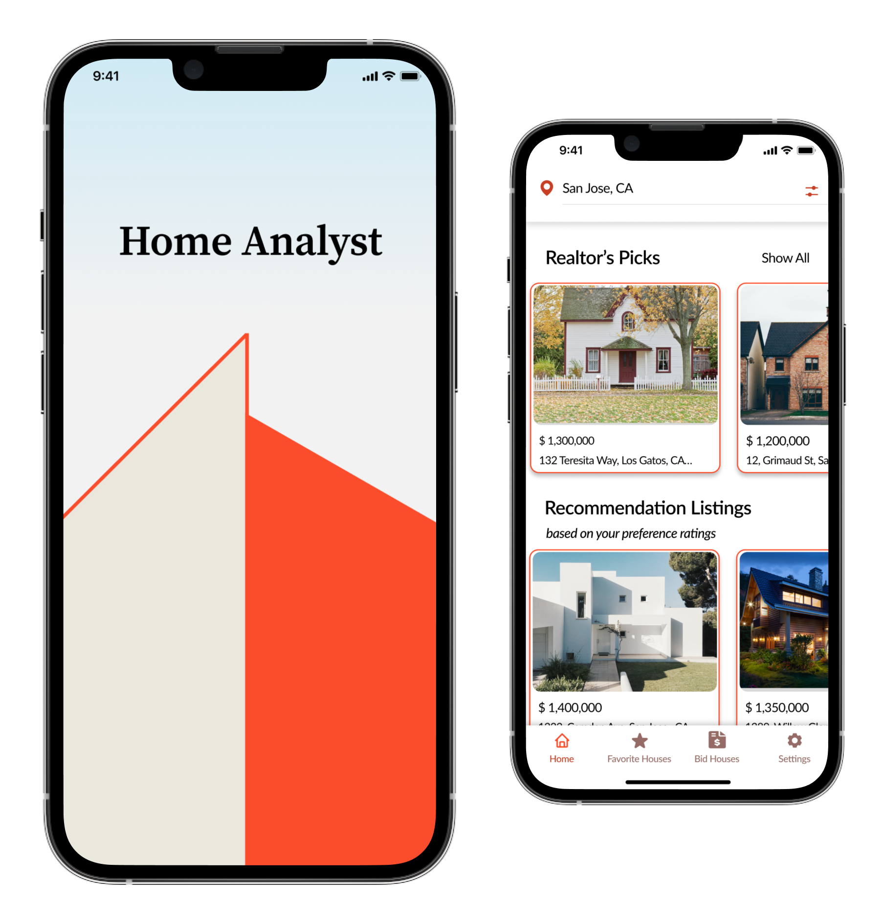
Solution : Home Analyst
A one stop app that helps not only summarize the main issues in a bite sized manner but also provide solutions for the issues
Overview
Project Overview

April to July 2022

UX Research, UX/UI Designer

iOS

Figma, Invision, Notability and POP

Image Credit : Unsplash
INTRODUCTION
During the exploration phase of the project, real estate stood out to me as a space that had several customer pain points and the existing solutions did not solve them efficiently. My goal was to create a solution that would guide the user through the stressful, overwhelming, and important decision to buy a home.
METHODOLOGY
For the design solution process, I chose to use Human-Centered Design. Human-Centered Design keeps the user truly in the center of things. It revolves around the perspective of the user, their problems, needs, and desires. As designers, we find an effective solution that meets their needs.
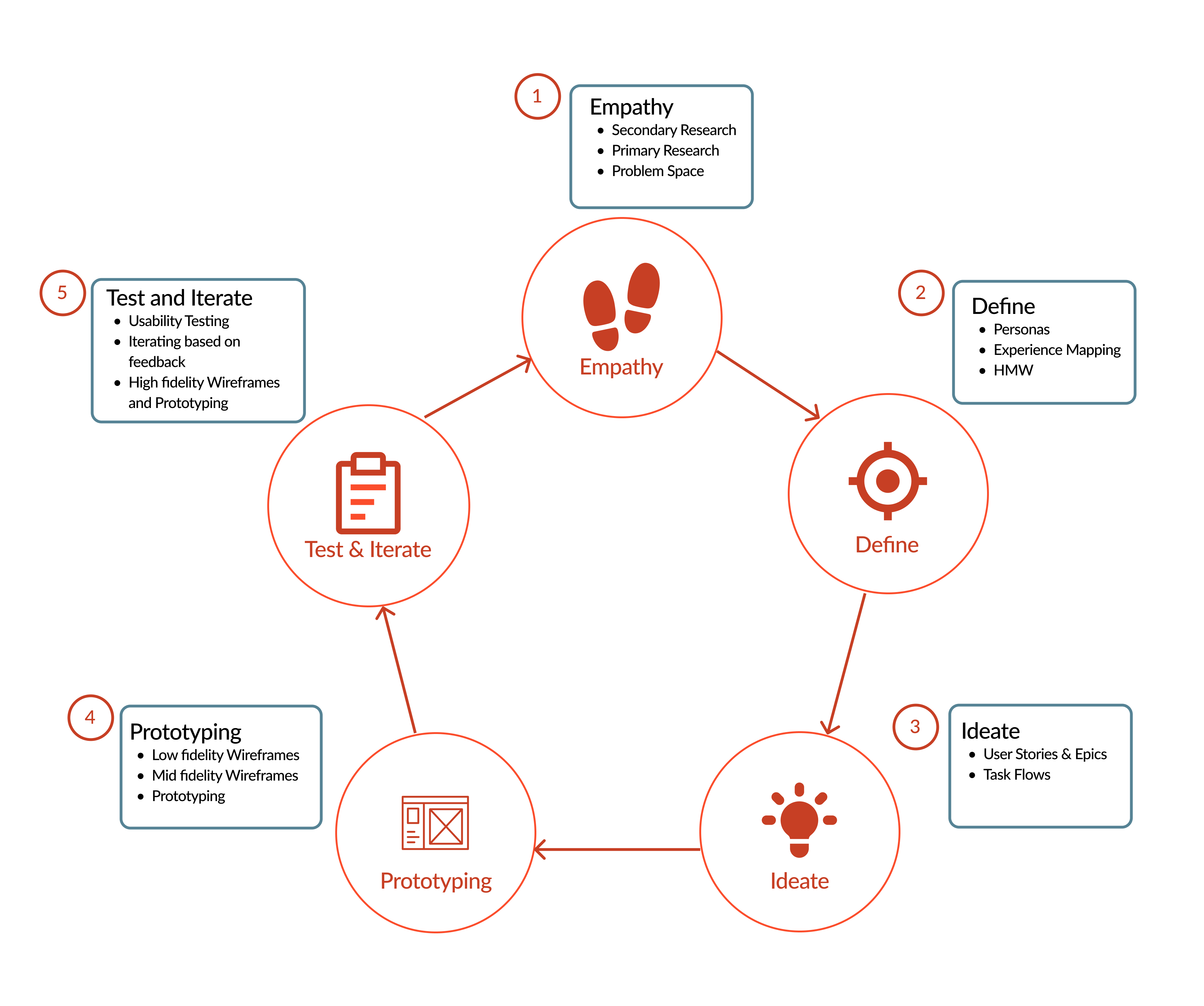
Human-Centered Methodology
Empathize
Problem Space
In today's competitive housing market, millennial first-time home buyers are struggling to purchase a house. There are not many houses on the market, and the ones that are there, are being purchased very quickly
How do first-time millennial buyers, use this short time, to make a decision on purchasing a house?

Image credit : Unsplash
Secondary Research

Millennials (25-40 years of age) are the biggest homebuying demographic in the U.S. right now, but the competition for housing is making it increasingly difficult for prospective homeowners to purchase a house.

Studies indicate that millennials are more likely than other generations to purchase a house that requires extensive repairs and care
The study also indicates that millennial home seekers are obstructed in the housing market by high competition, expensive prices, low inventory of affordable housing, and competition with more financially stable and home-seeking-savvy generations.
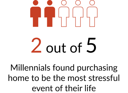
Even though the homes are appreciating at a much faster rate than they were before the pandemic, making a home more valuable usually entails a lot of work.
Understanding the User Issues through User Interviews
I conducted 3 user interviews over video calls to obtain qualitative feedback regarding the problem statement.
Based on my secondary research, I had expected to interview people and hear from them about the impulsive decisions they made under stress or while competing for a bid, however, all of my interviewees took calculated risks, however, they all agreed on having to compromise on different levels when purchasing their first homes

Image credit : Unsplash
THEMES IDENTIFIED BASED ON USER INTERVIEWS

Users found the process of reading and understanding the inspection and disclosure reports very challenging
They were overwhelmed by the issues present in the house and were often unable to assess the additional cost required to fix the issue

Inability to assess the “fair” price of the house based on the market condition. All of the users used relativistic valuations instead of attempting to perform an intrinsic valuation
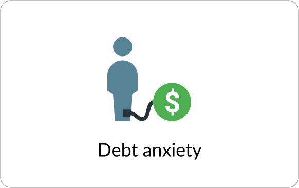
Users were stressed with the amount of money that they had to allocate towards the downpayment of the house (usually 20% or higher) and the debt that they would be signing into
Key Theme for Solution : Learning Curve is High
Based on user interviews and affinity mapping, I identified that there was no existing product in the market to help first-time home buyers.
The interviewers indicated a need for a solution, that helps them make an informed decision without being bogged down by excessive documentation and complicated terminologies associated with real estate.
Define
PERSONA
To better understand the needs of the users, I chose to create a Persona to help understand our users better.
Personas are fictional representations and generalizations of a cluster of your target users who exhibit similar attitudes, goals, and behaviors in relation to your product
Source: 1
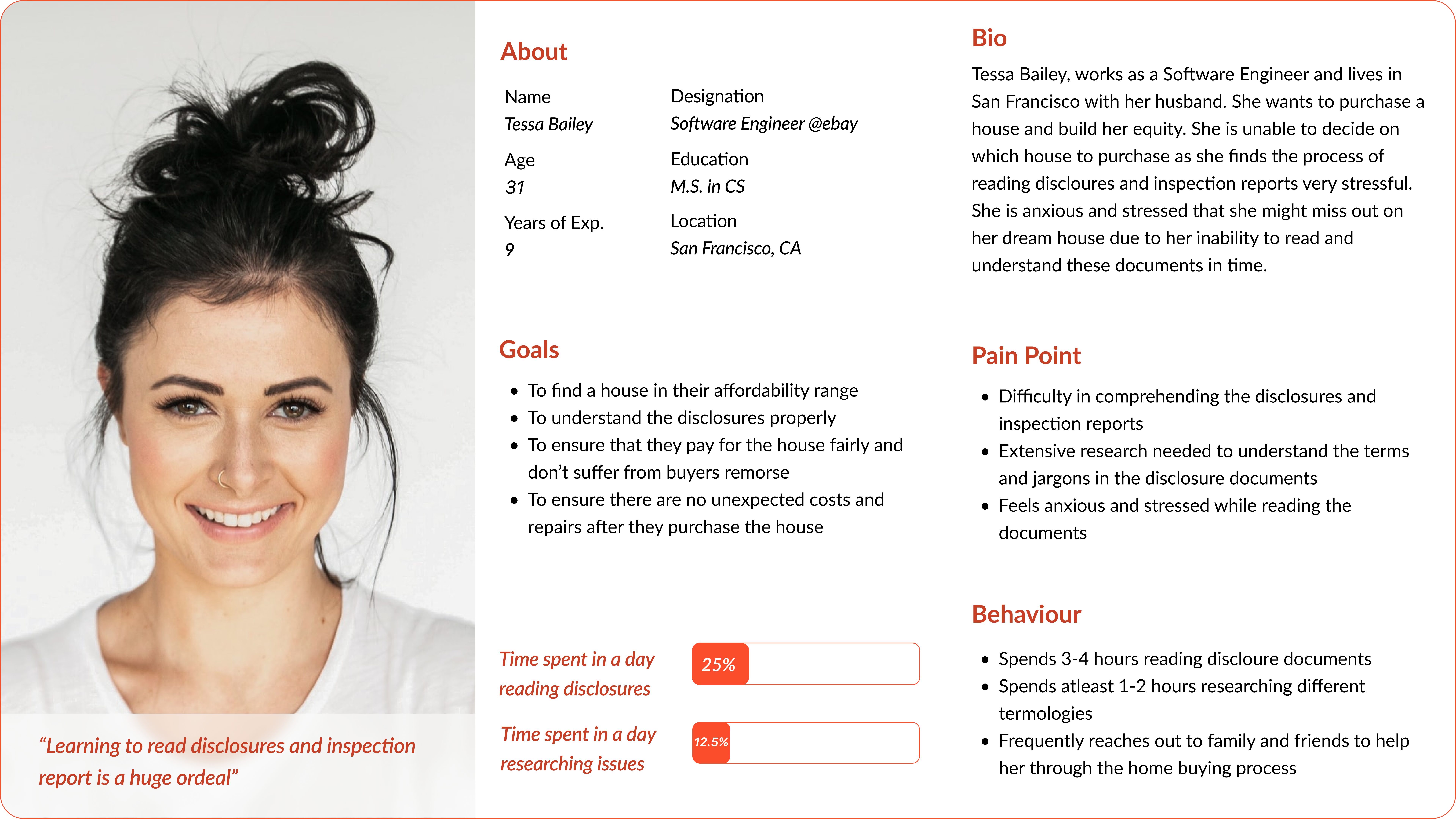
User Persona
EXPERIENCE MAPPING
Using Tessa's pain points and needs, I created a experience map to better understand her journey as a millenial first-time home buyer.
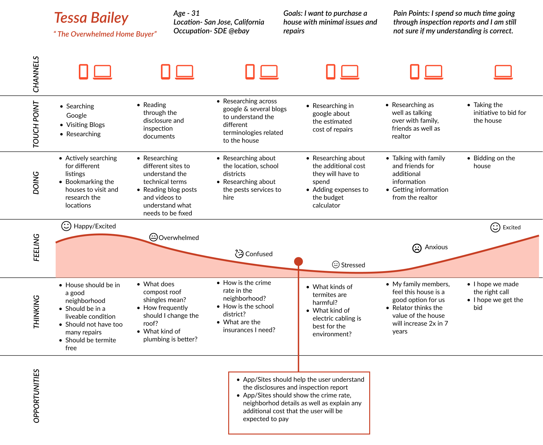
Experience Mapping
Which leads us to How Might We,
How Might We help millennial first-time home buyers to understand the house inspection & disclosure documents effectively to make an informed purchase decision?
Ideate
User Stories
User stories are written from the perspective of users, indicating the different features of a product. Several user stories combined together are called epics.

Top 4 Epics
Based on Tessa's needs and the "How Might We" question, I created 4 Epics and generated 37 user stories to develop the functionalities of the product.
User stories are written from the perspective of the product and enables creation of a user centric product.

Core Epic : Reseaching the house
Based on the user stories and the issues faced by the users, we chose to delve deeper into the Epic : Researching the house.
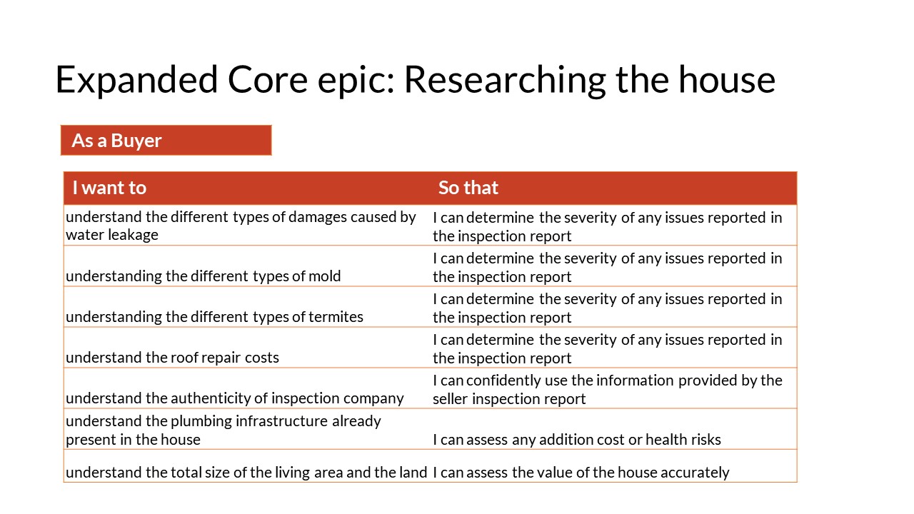
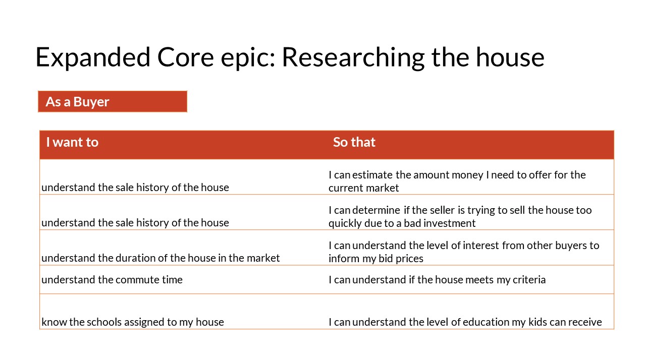
User Stories for Core Epic : Researching the house
Task Flow
Task Flows represent the linear steps a user takes to complete a specific task.
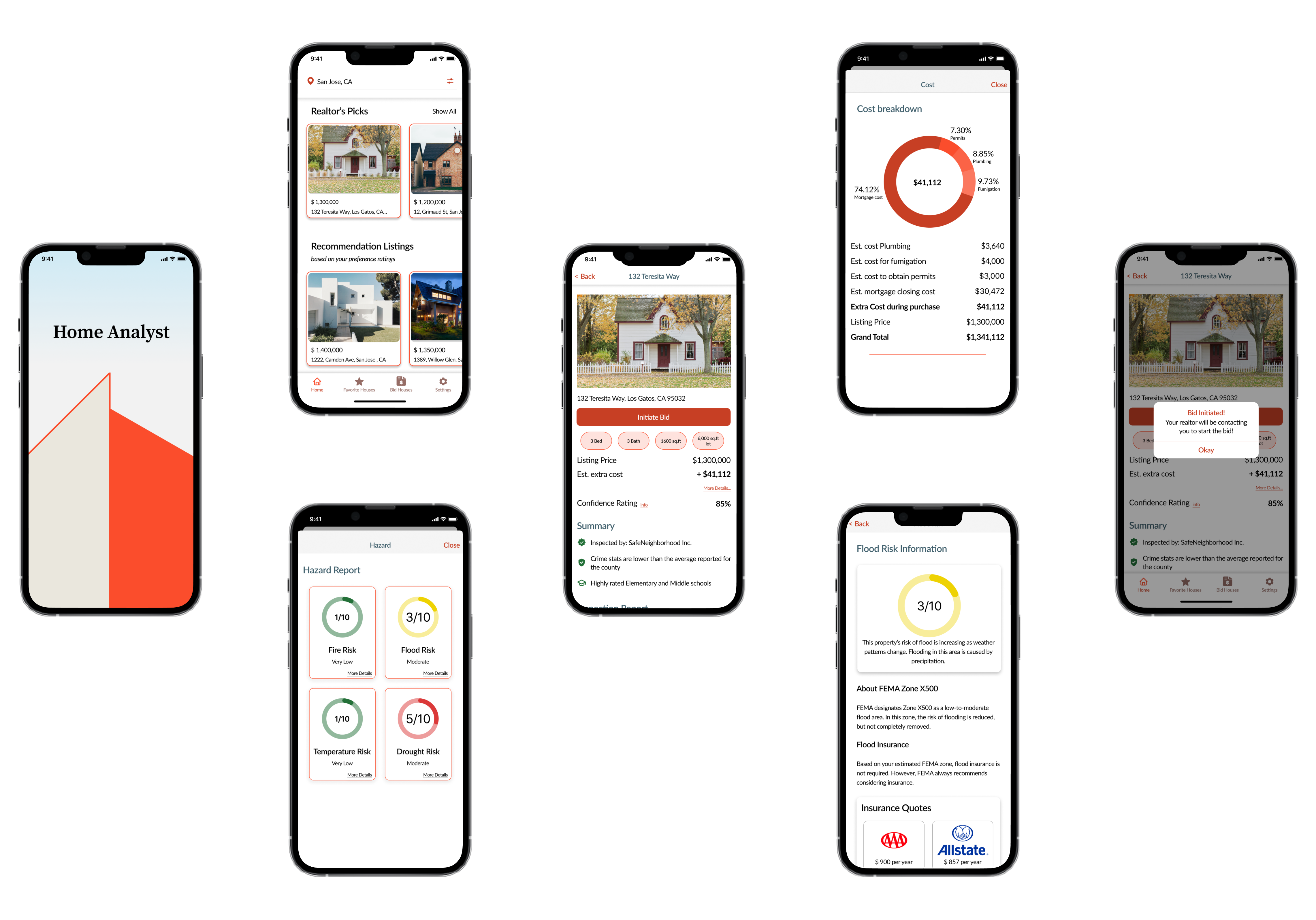
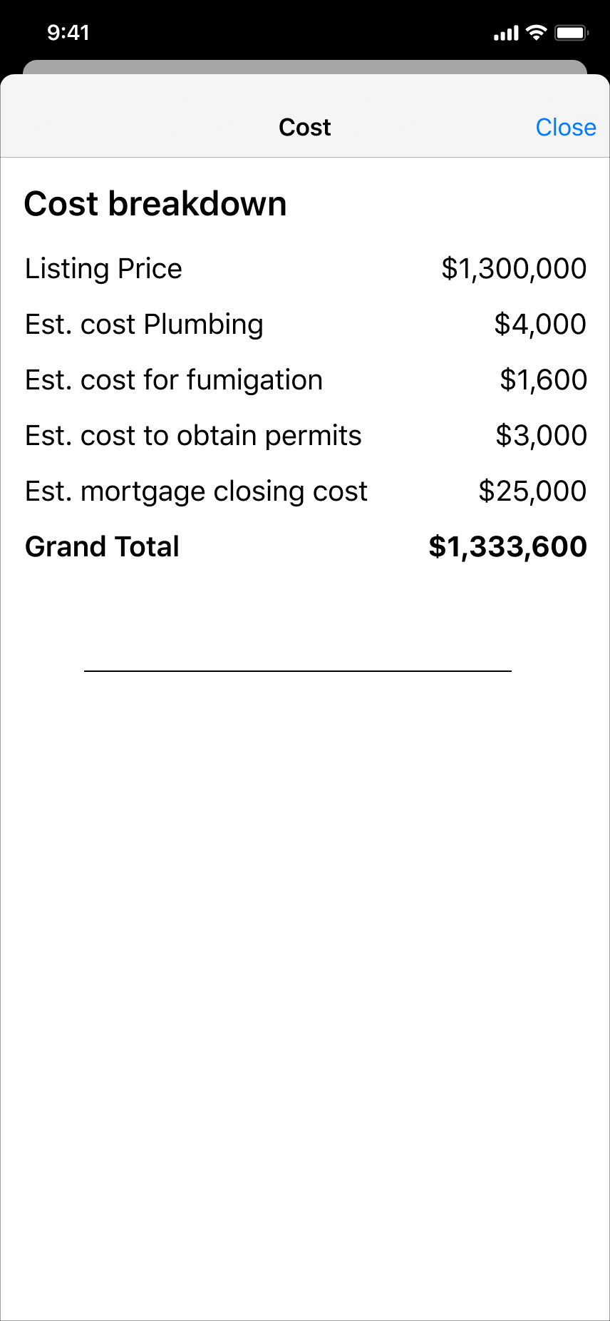
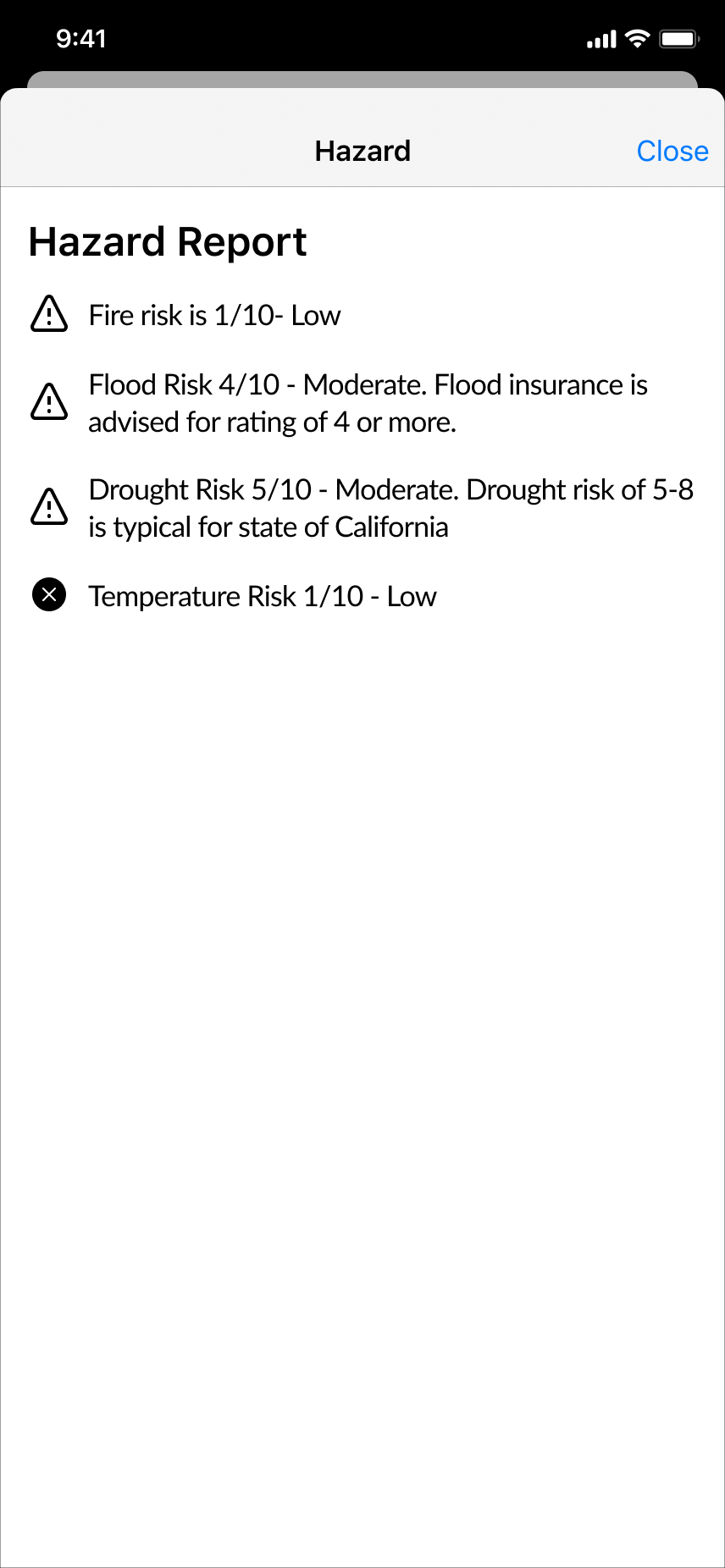
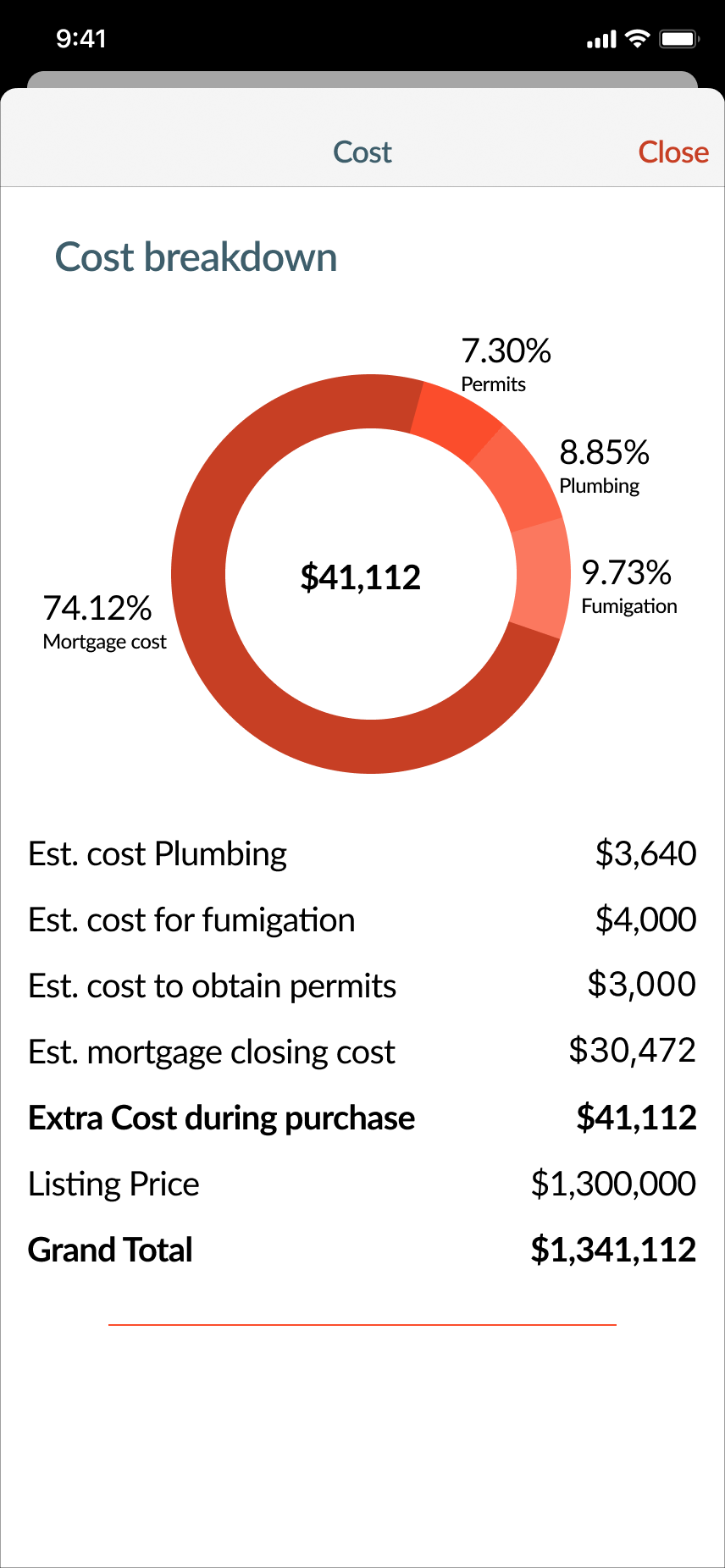
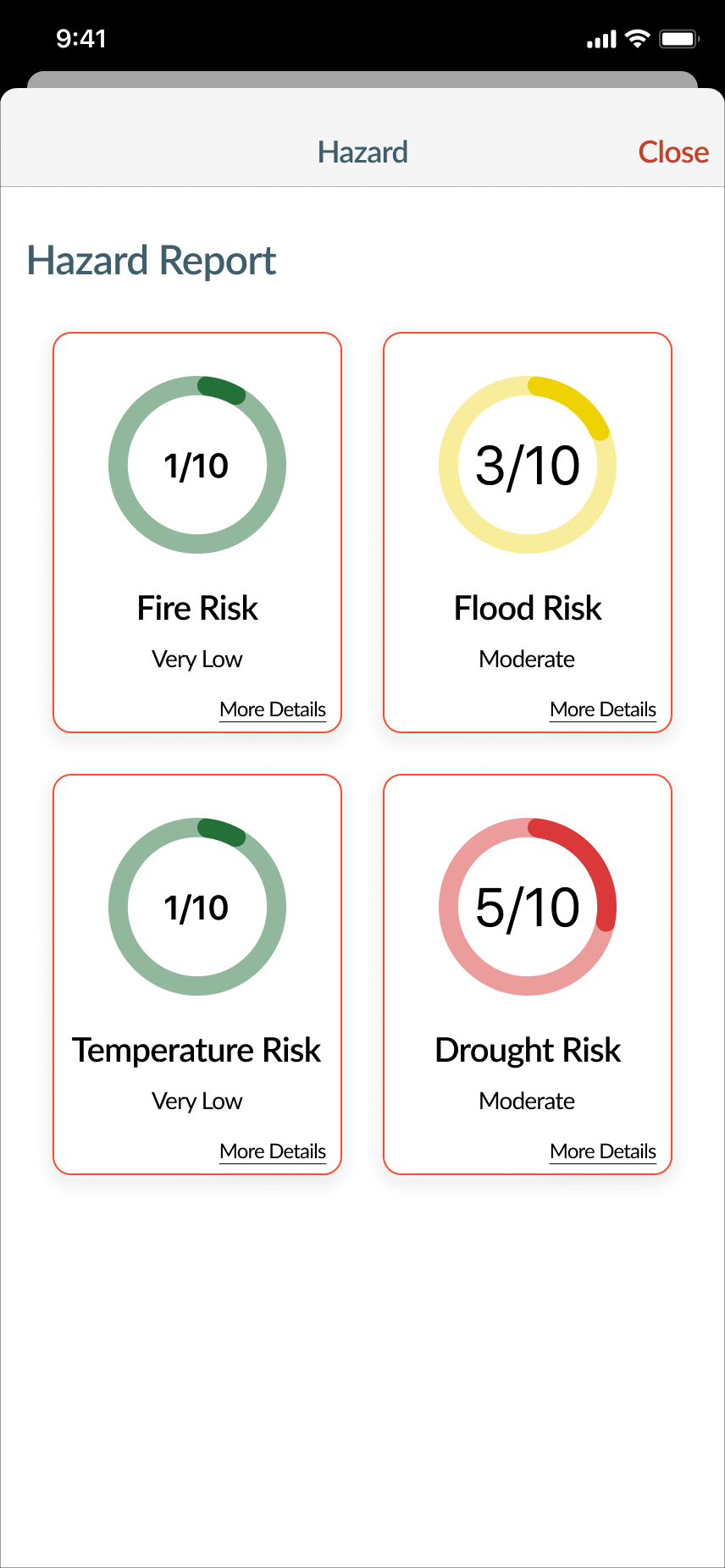
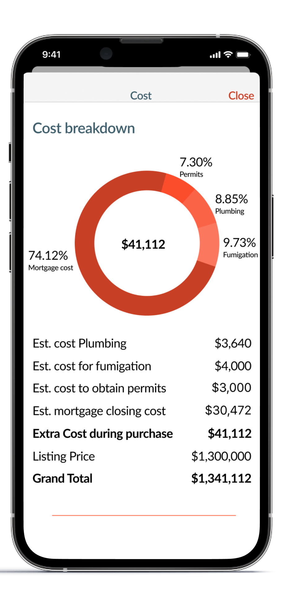
The Primary task flow depicted below shows the steps the user takes to research a house before placing an offer on it. The user is given a concise summary of all the issues the house may have, including
- Showing the authenticity of the inspection company
- Providing a confidence rating for the house
- The estimated breakdown cost for any repairs
The task flow aims to instill confidence in the buyer and provide them with the information they require, to make an informed purchase decision

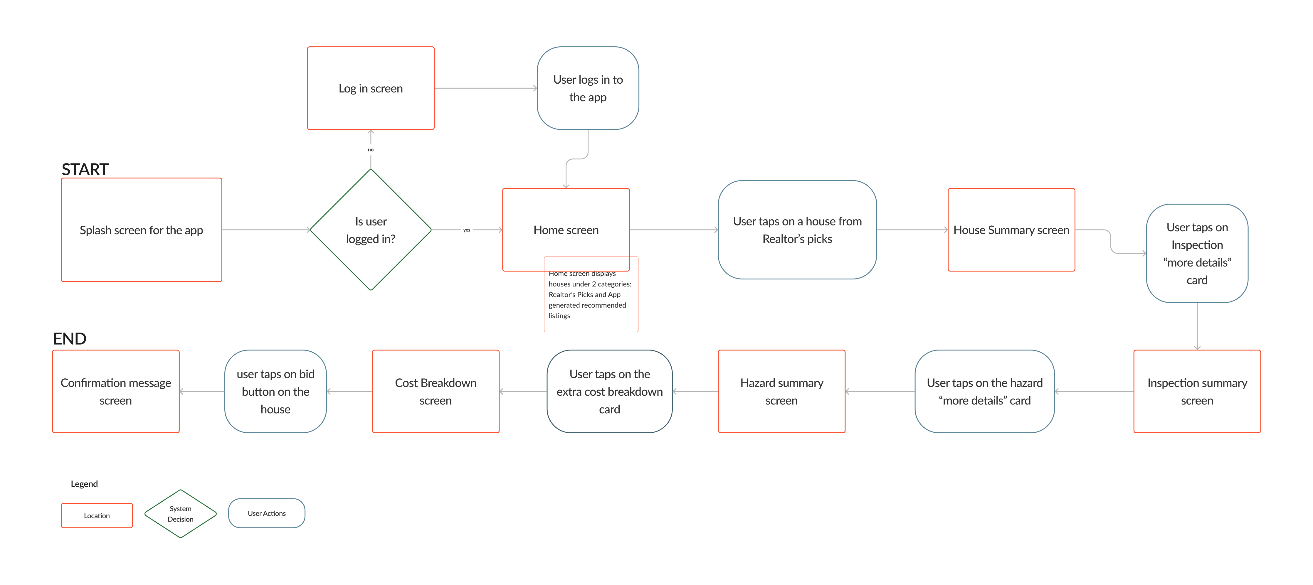
Primary Task Flow
Prototyping + Test & Iterate
Sketching
After the task flow, I was able to start sketching the different solutions for the users like Tessa. The inspiration for the app came from real estate apps like Redfin, Realtor, and concepts designed in dribbble. I used the notability app to sketch the various screen in the app
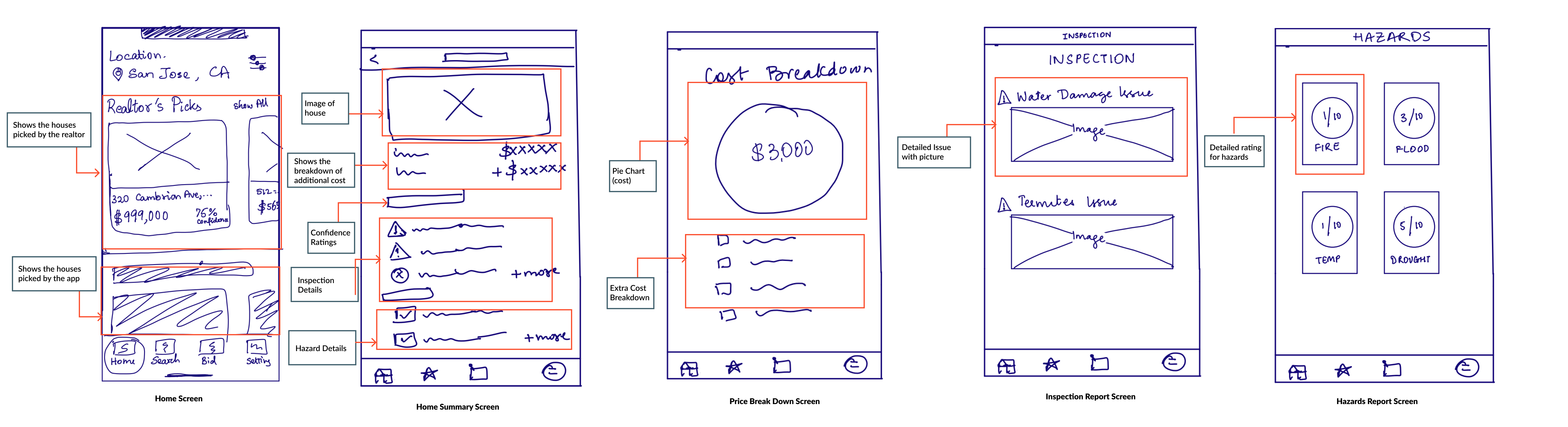
Final Sketches for the app
Mid-Fidelity Wireframes and User Testing
User testing is a powerful tool, which helps designers to obtain feedback from testers. In addition, testing helps designers understand if the design solves the problem.
Based on the solution sketches, I created the first version of medium-fidelity grayscale wireframes using Figma. This was followed by conducting 2 rounds of Usability testing over zoom video calls with 8 participants.
The testers were provided with the 5 scenarios and were directed to perform different tasks. Their feedback was gathered in the Usability Testing Plan & Session output document.
Based on the user feedback, I created totally 3 versions of the wireframes and performed a second round of user testing.
EVOLUTION OF HOME SCREEN
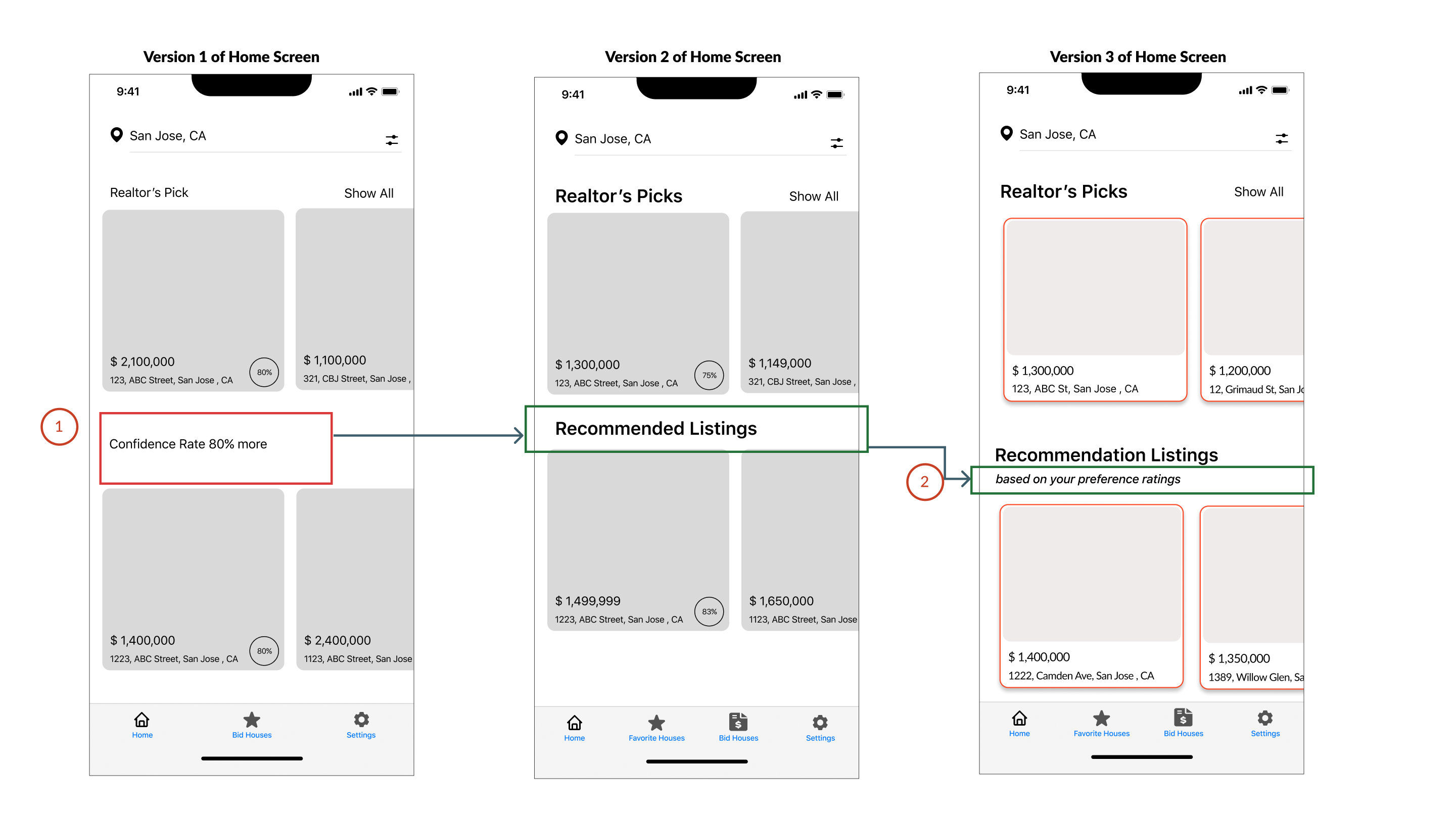
Different Versions of Home Screen based on User Testing Feedback
Summary of Changes
- In Version 1 of the wireframes, the testers found the Confidence Rate heading to be confusing. In version 2, I relabeled the heading to "Recommended Listing"
- After the 2nd round of user testing, the testers indicated that they felt the heading's purpose was unclear. So in version 3 of the wireframes, I added another subheading that informs users that the houses that are listed have been chosen for them based on their preferences
EVOLUTION OF HOME SUMMARY SCREEN
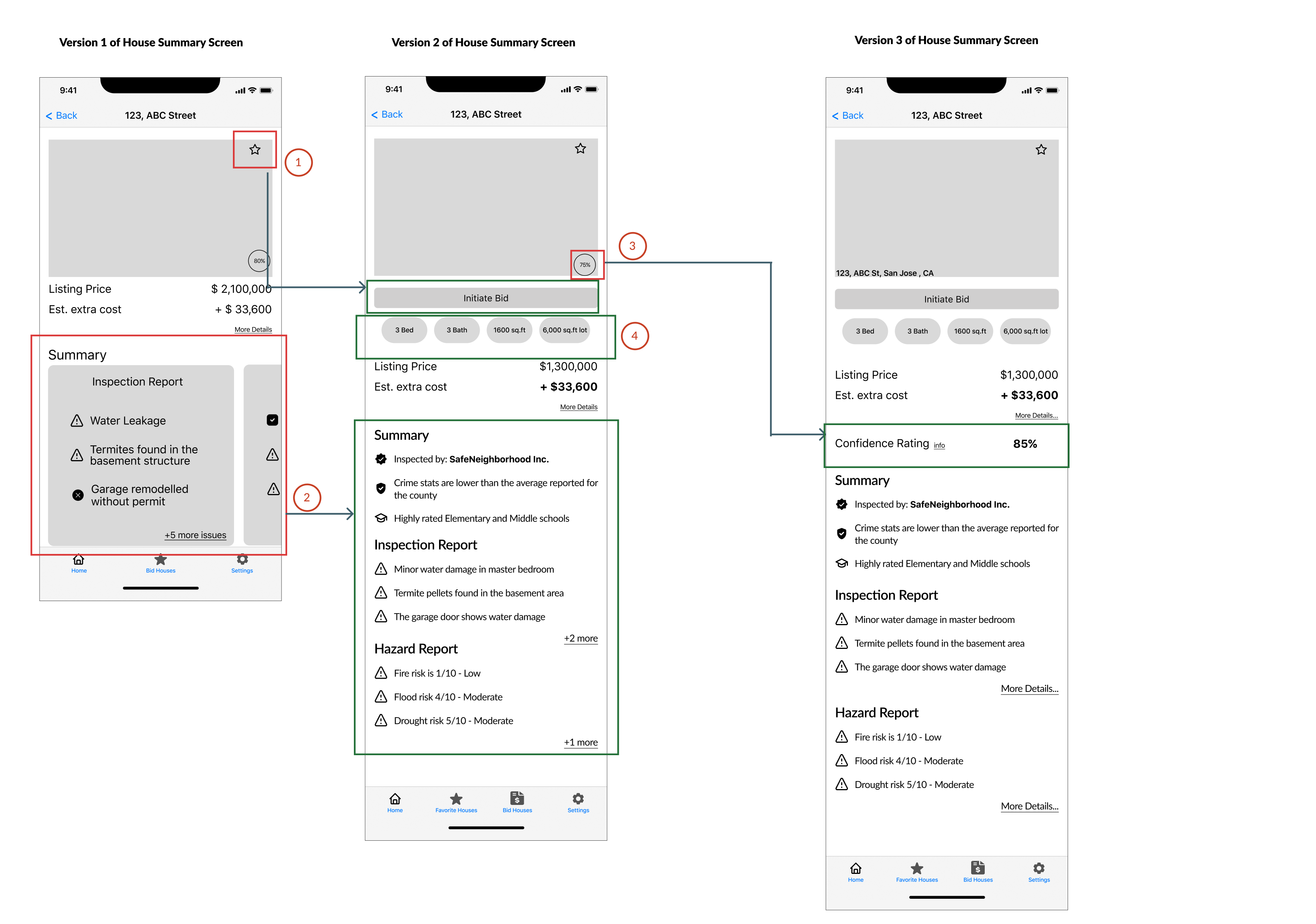
Different versions of House Summary Screen based on the User Testing Feedback
Summary of Changes
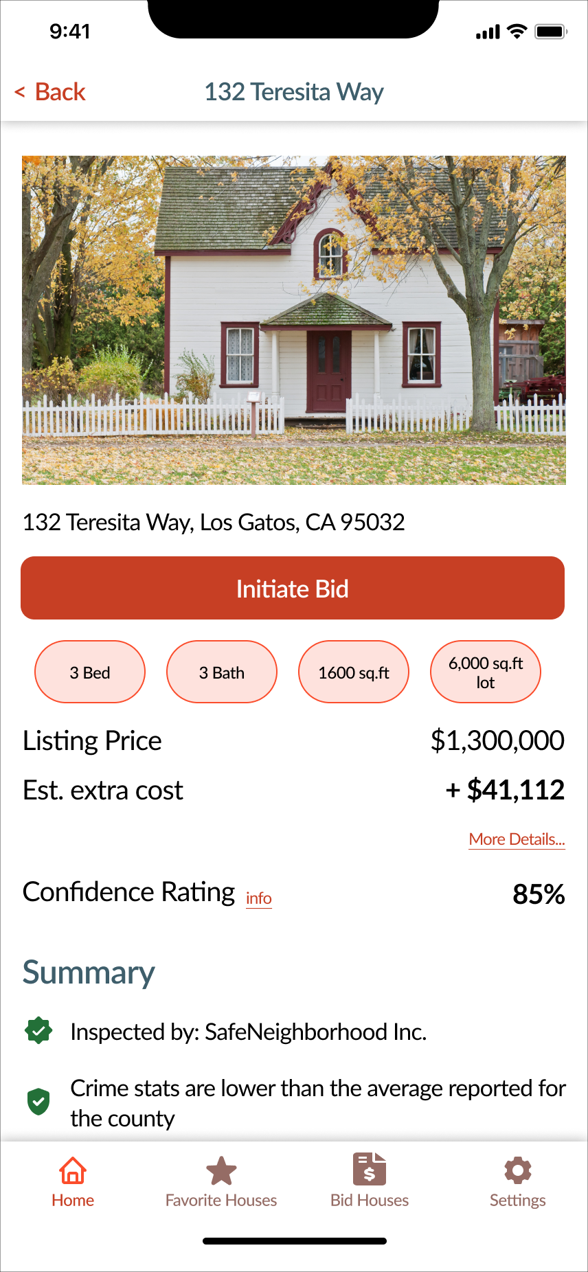
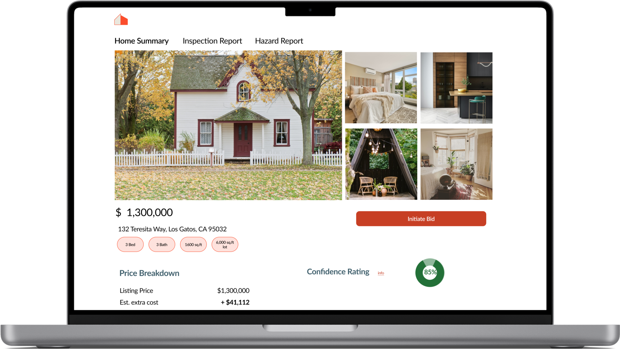
- In version1 of the wireframes, the testers had difficulty initiating the bidding process. The testers felt the “star” icon resembled a favorite icon rather than a button for starting the bid process. In the version2 of the wireframes, I added a large CTA button to “Initiate the bid” process for the house
- In version 1 of the wireframes, the testers felt that they might miss out on report details if the information was presented to them in a carousel format. In the version2 of the wireframes, I changed the layout of the screen to better indicate the different reports
- The testers wanted more information regarding the house, like the number of beds, etc, so for version 2 I incorporated those details as pills under the "Initiate Bid Button"
- During the second round of user testing, the testers indicated that the confidence rating feature for the house was not clear. In version3 to mitigate that issue, I created an overlay information icon that states the usage of the confidence rating button
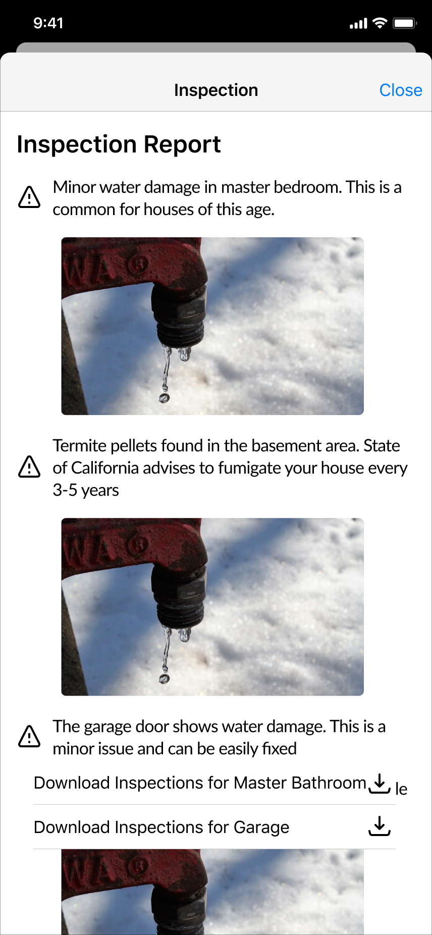
EVOLUTION OF INSPECTION SCREEN
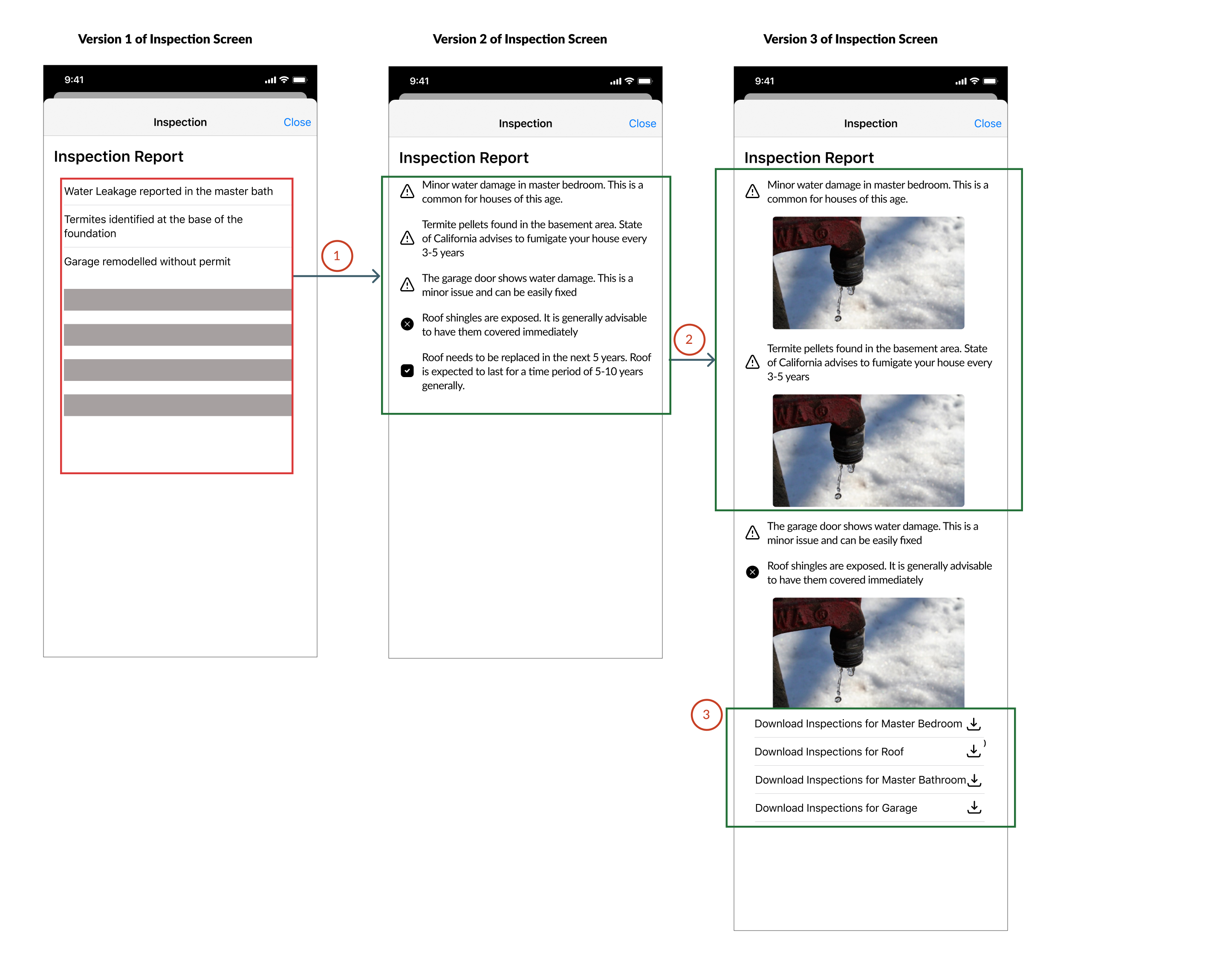
Different Versions of the Inspection Screen based on User Testing Feedback
Summary of Changes
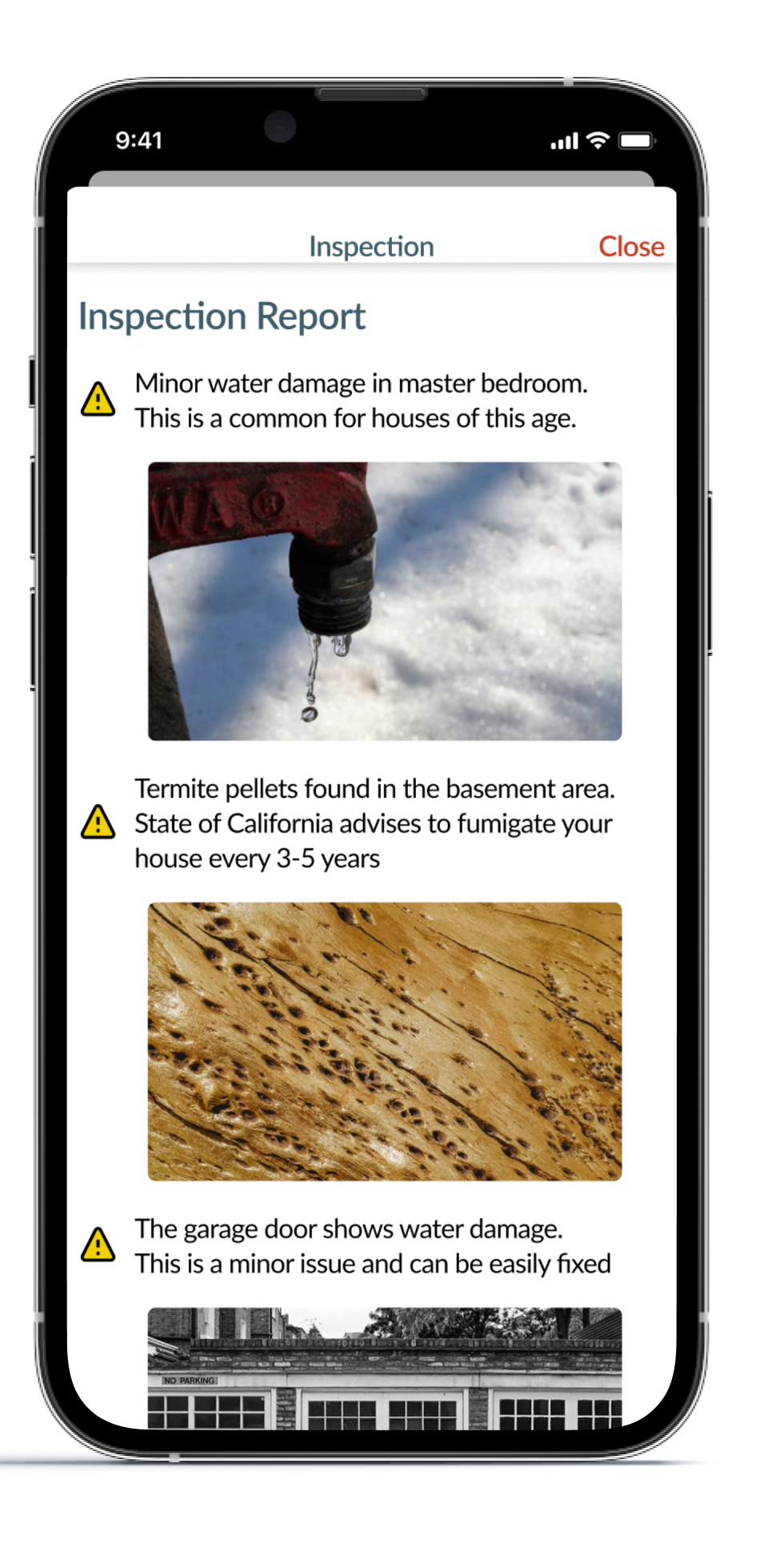
- In version 1 of the wireframes, the testers felt that the inspection details were alarming and they needed more contextual information. Hence in version 2, there is more contextual information to provide an objective report instead of being alarmist
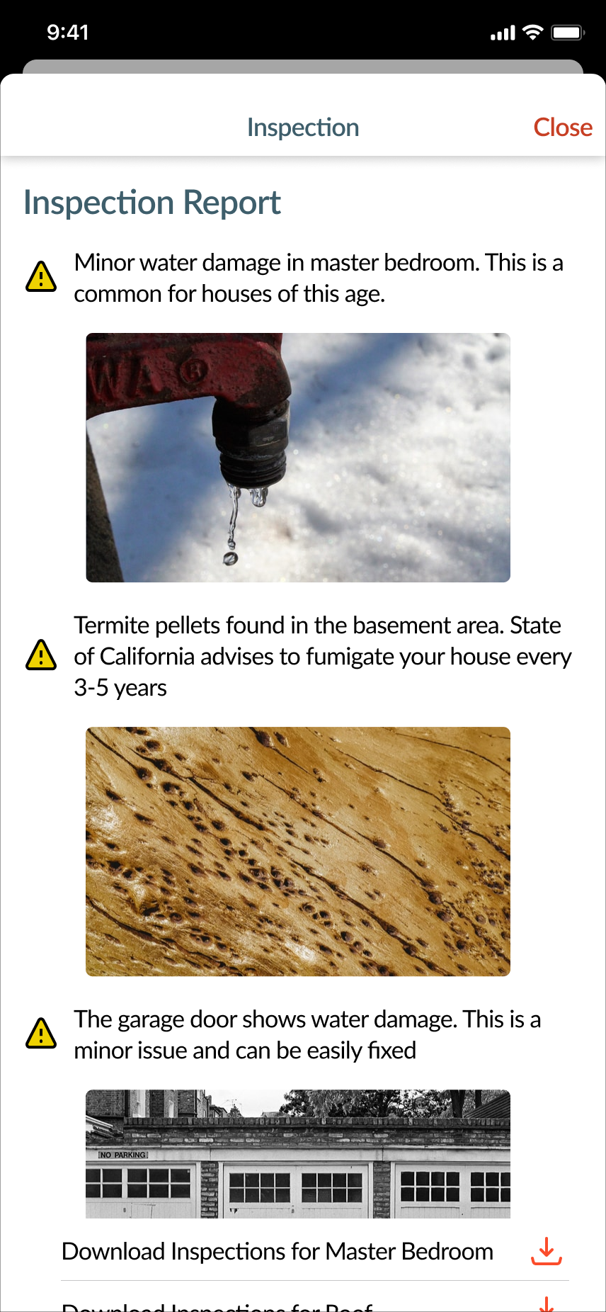
- After the 2nd round of testing, the testers stated they needed more information regarding the different issues in the house. As a result in Version 3 of the wireframes, I added pictures from the home inspection reports to show the severity of the damage
- In version 3, the users have the option to download the pdf reports to parse through finer details of the inspection
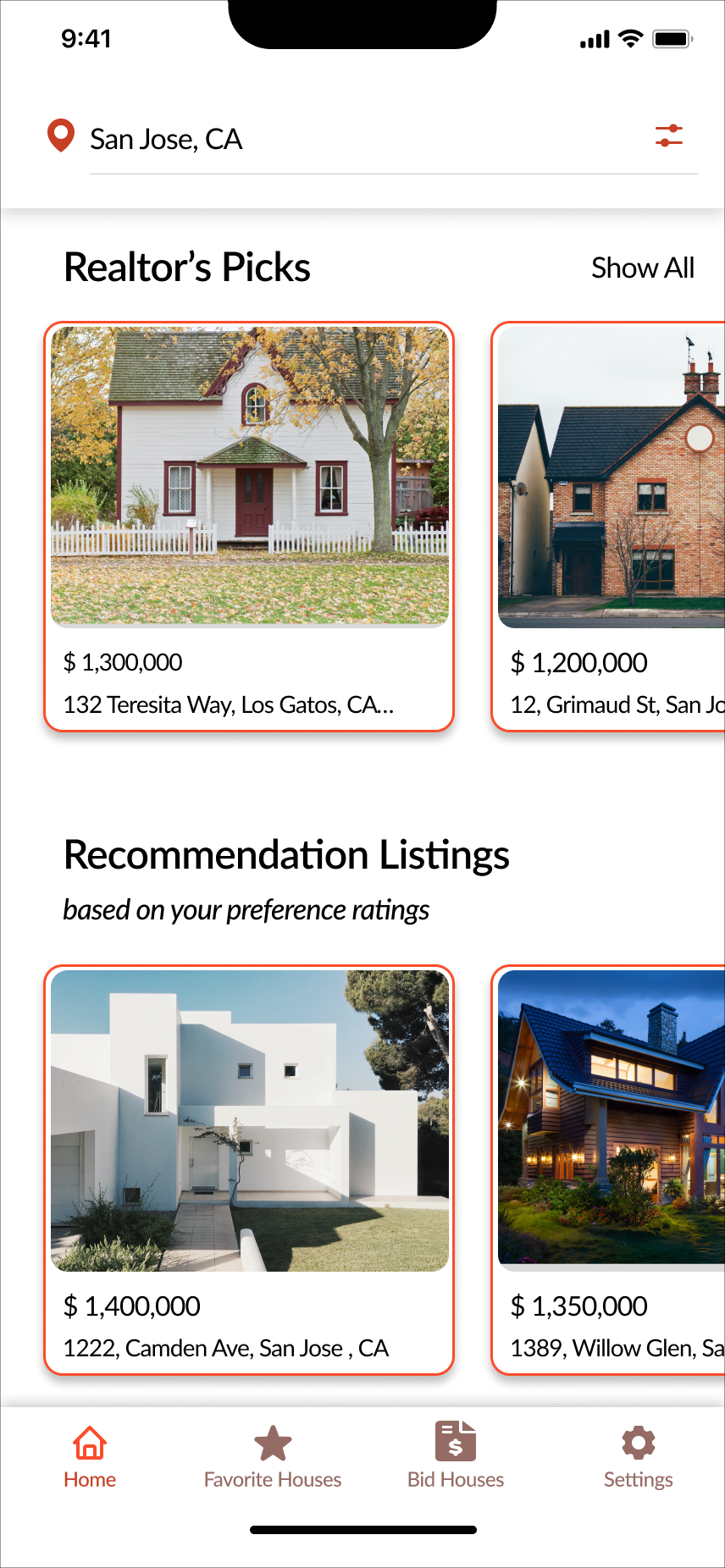
Final Mid-Fidelity App Prototype Gallery
Final Grayscale version of the wireframes that is translated into High Fidelity Version
Visual Identity Story
After finalizing the wireframes for the app, I started to explore the visual identity of the brand.
The visual identity of the brand is represented by choosing brand adjectives, mood board, color palette, and Typography for the app.
Choosing a brand adjective is an essential part of this process that emulated the emotions you want the user to experience while interacting with your app.
Brand Adjectives
Empower
Introspective
Reliable
Informative
Calm
More A than B List
More informative than overwhelming
More empowering than constricting
More concise than ambiguous
More calm than clutter
More introspective than indifferent
More trustworthy/reliable than flaky
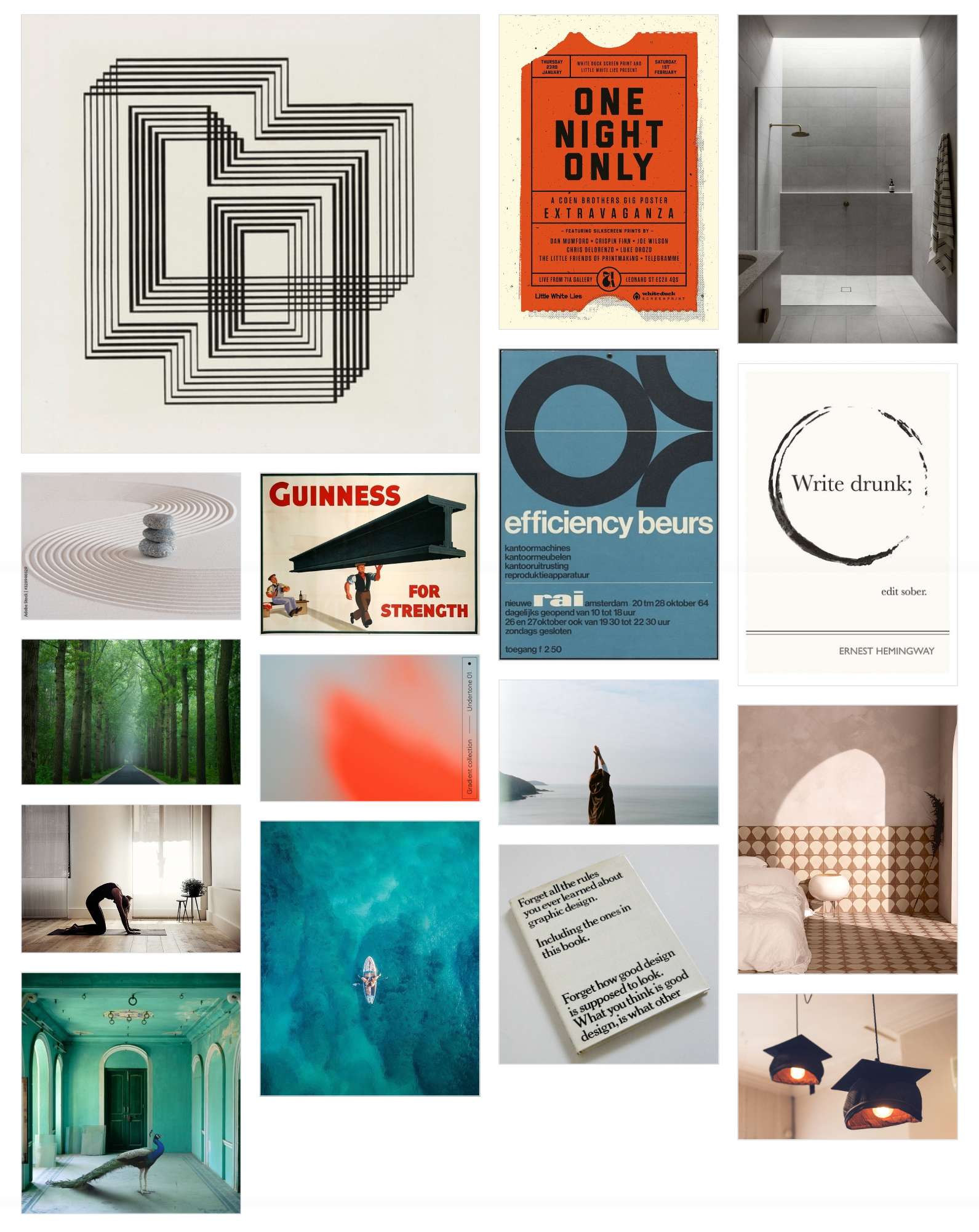
Mood Board
I developed a mood board to reflect the key adjectives that I have chosen for the brand
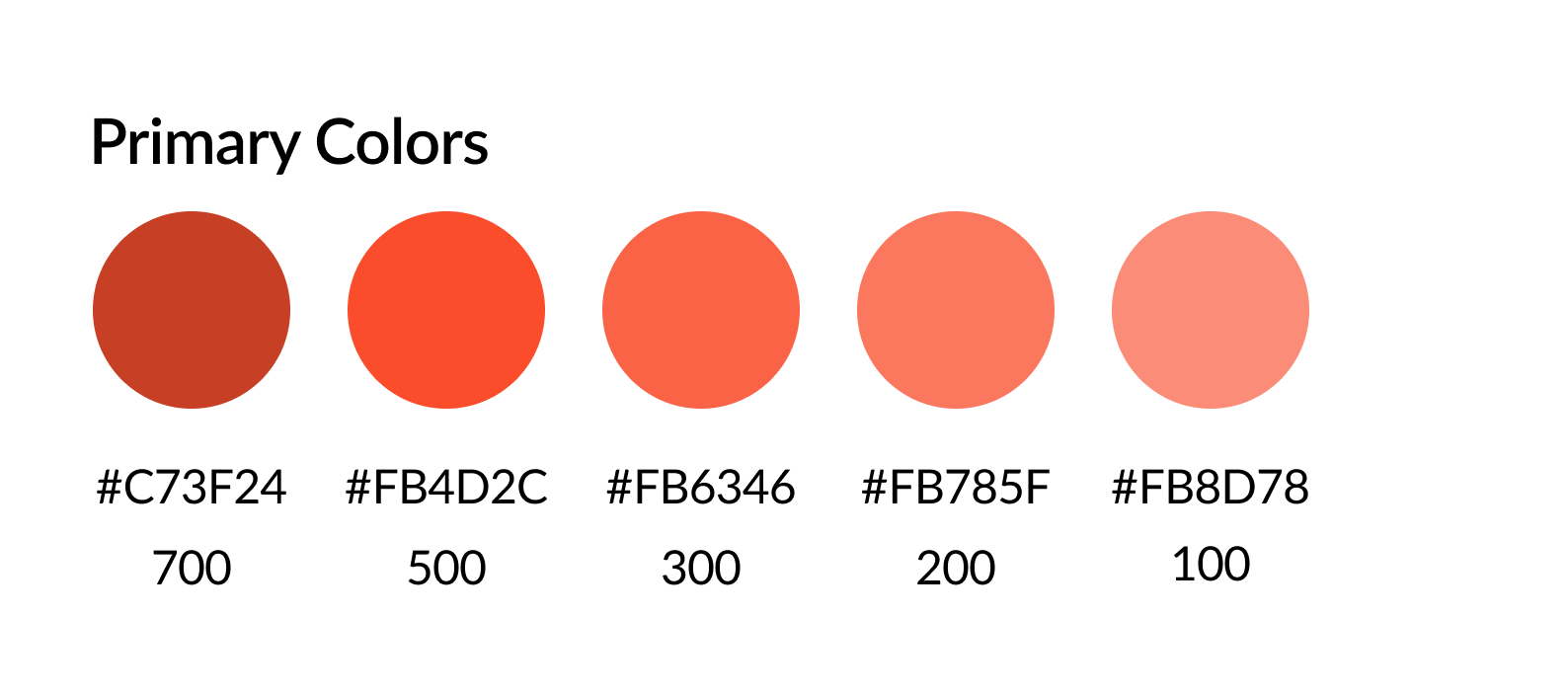
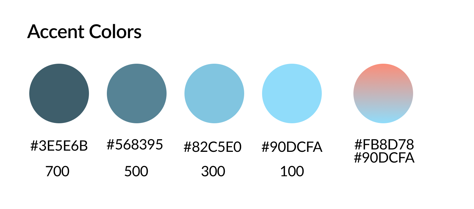
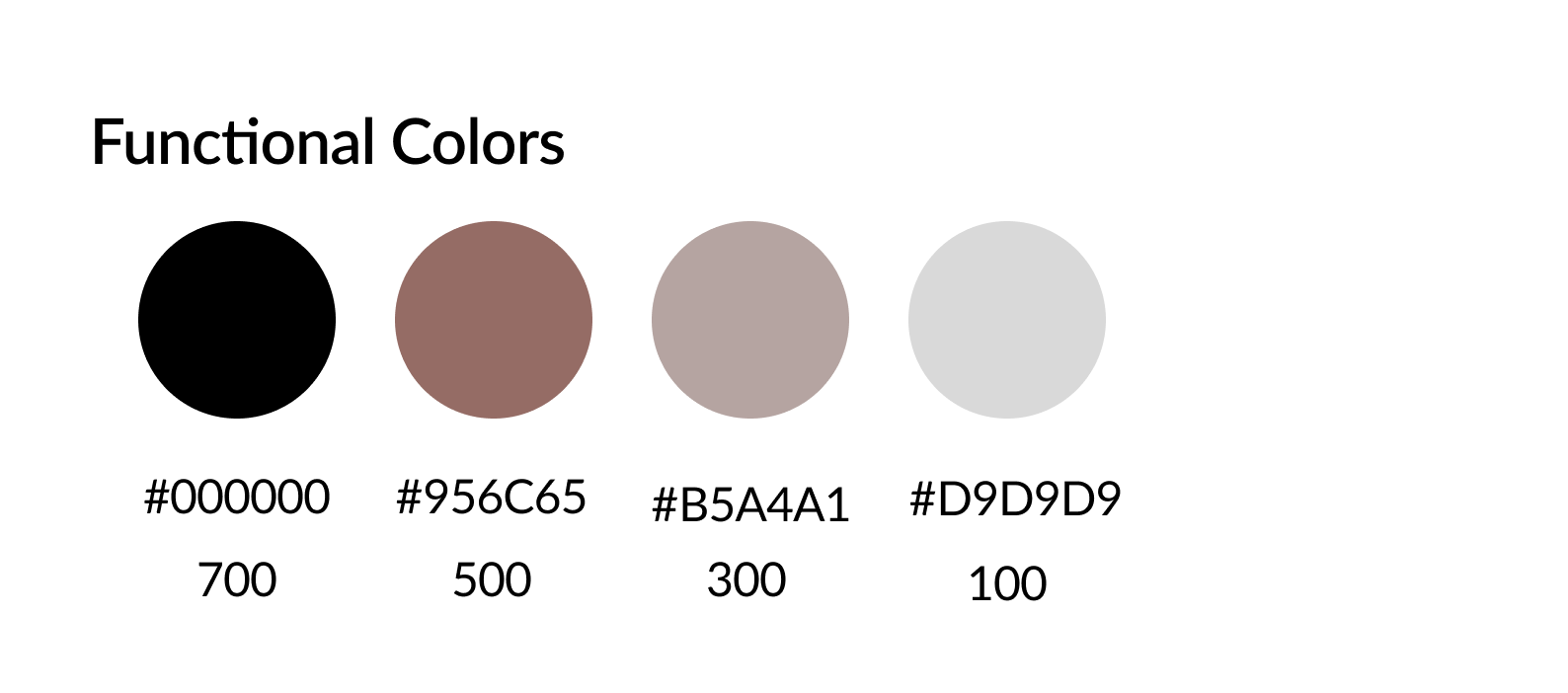
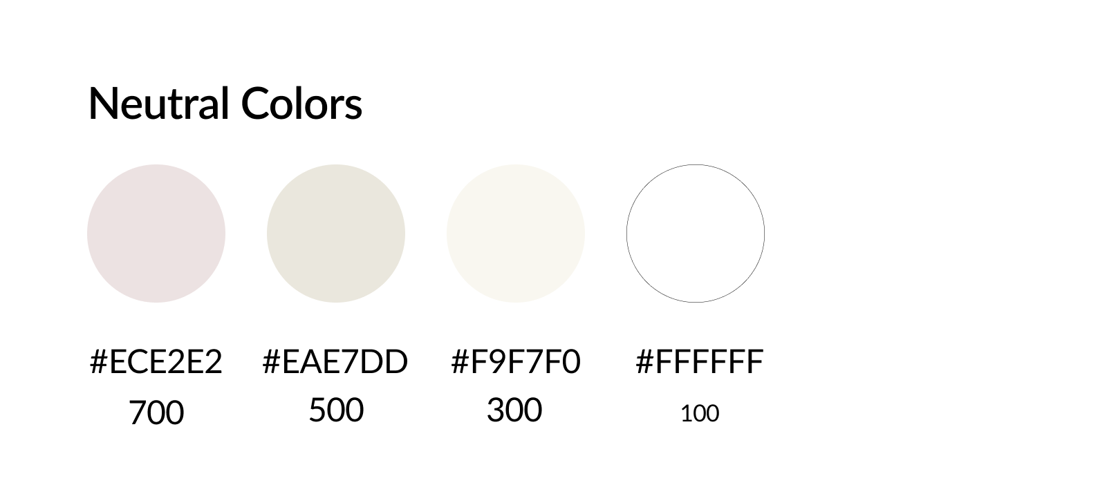
Color Palette
The colors were chosen in conjunction with the mood board and the branch adjectives for the app, which is empowering users. The color orange symbolizes new beginnings and opportunities
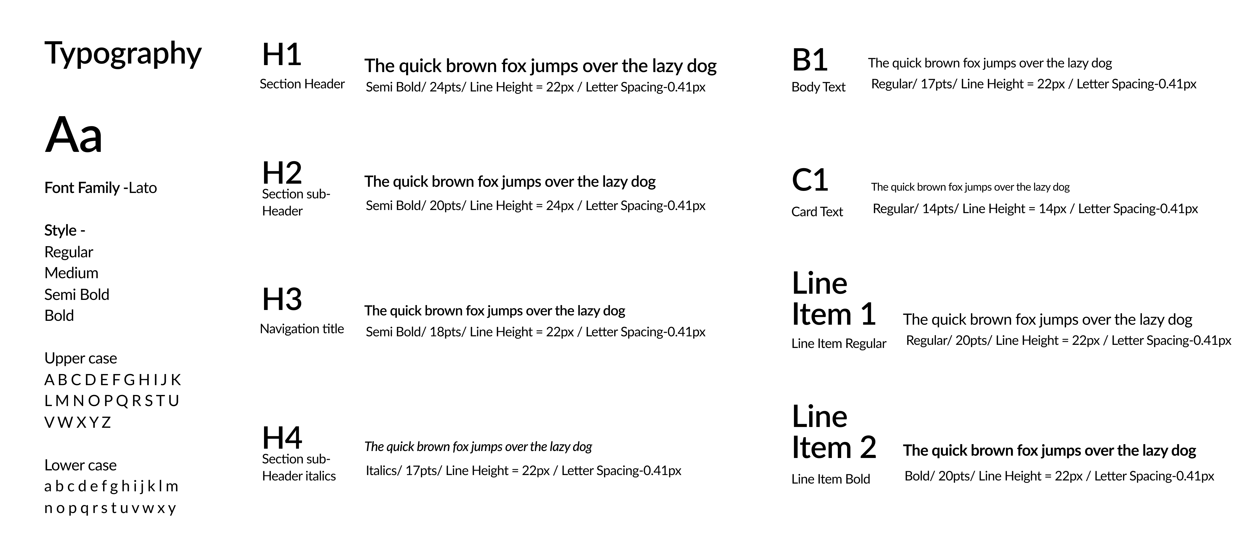
Typography
While choosing the typography for the app, the main focus was on the readability and legibility of the font. For this reason, I choose to work with Lato.
Lato is a simple, clean, and beautiful font with high legibility across different sizes.
Wordmark Exploration
While exploring the application name and icon, I wanted to create names that worked with the brand adjectives and were easy to remember. It was important that the app name emulated confidence in the user. After several iterations, I choose to go with the name "Home Analyst" based on educator feedback. I opted to work with the font "Source Serif Pro" for the wordmark, as the font's clean and bold serifs fit well with the app.
For the icon, I really liked the structured lines along the roof of the house and explored different versions to emulate the lines of the roof.
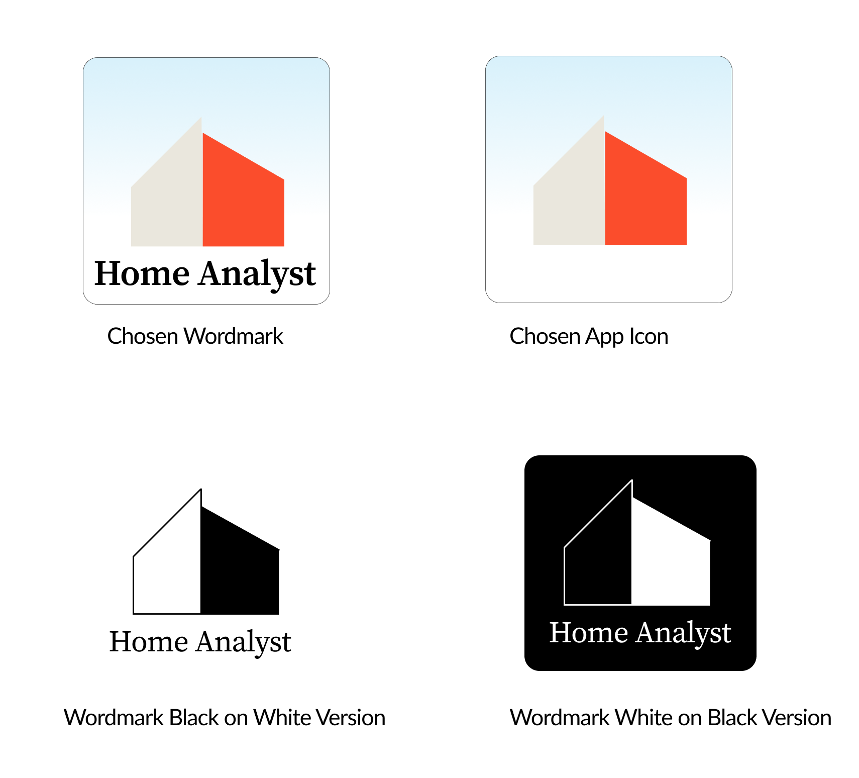
Final Wordmarks and Different Variations of the wordmark
Features that makes Home Analyst unique
Home Analyst analyzes and provides a complete breakdown of the extra costs a new home buyer would have to pay in order to purchase the house. There will be no more hidden surprises with Home Analyst
"Home Analyst" parses through 100s of pages of inspection and disclosure documents and provides a concise summary report indicating the different issues with the house
Marketing Site
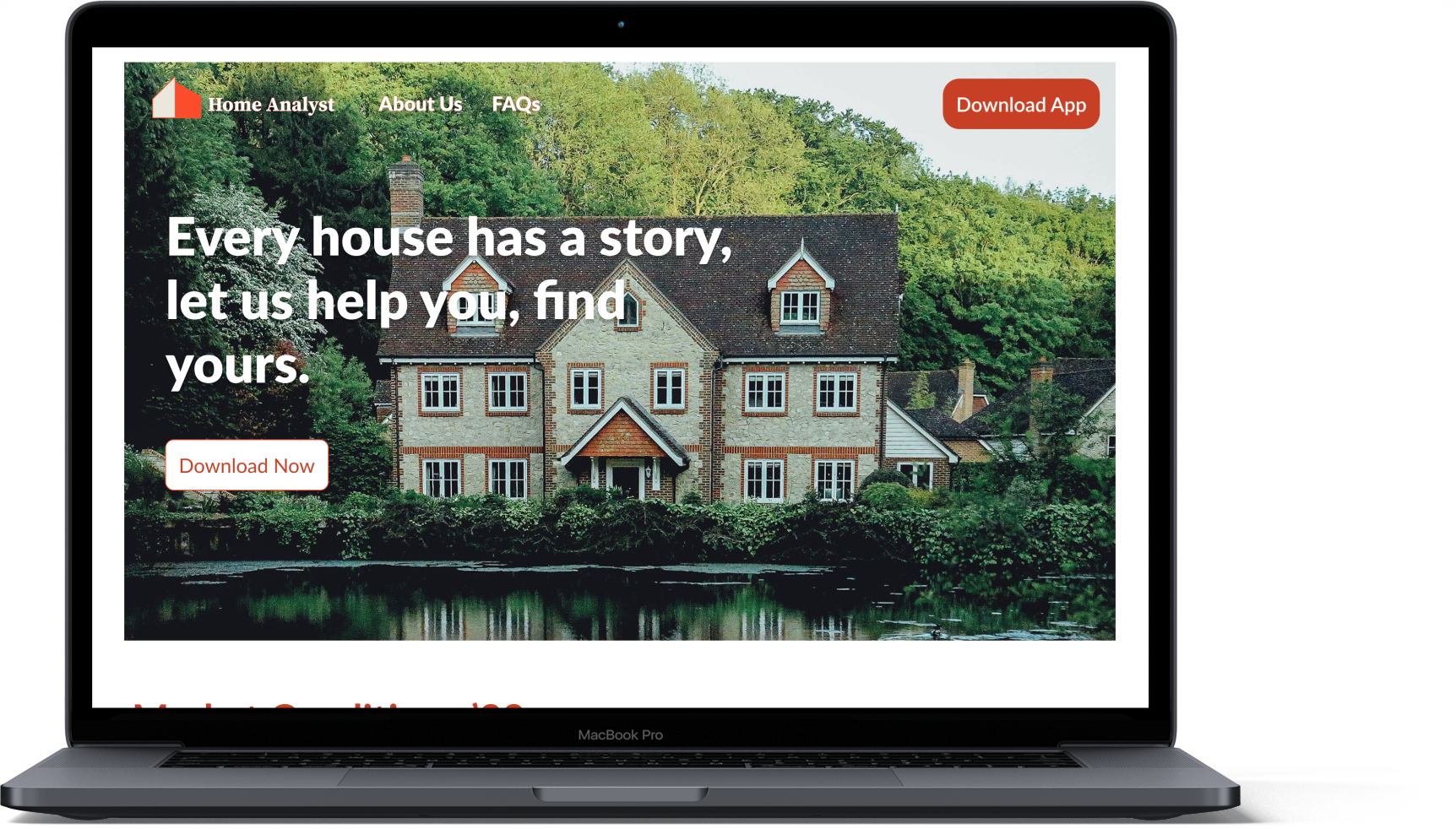
The marketing website informs the user of the current issues in the market regarding home purchases and highlights the features that distinguish Home Analyst from other apps in the market.
To create a compelling marketing site, I curated a UI inspiration board, and an updated mood board and created new sketches for both desktop and mobile versions. Based on the sketches, I created two different variations of the medium grayscales wireframes. After receiving peer feedback, I choose to create a High fidelity version of the wireframes in desktop and mobile versions.
Cross Platform Design
Home Analyst is a content-rich app, in order to explore cross-platform scenarios the logical cross-platform choice would be either a desktop or tablet.
I wanted to understand how the user interaction would differ if the users were to interact with the product using a desktop or tablet and how the experience would vary compared to the iOS mobile version.
I created a UI inspiration board to better understand the different design aspects I would need to consider. I sketched a few ideas before creating a Medium grayscale wireframe and then later converting it into a High fidelity version.
Next Steps & Key Learnings
Next Steps

Testing and Iterating
A series of user tests will help us identify the effectiveness of the product and identify the problems users are having with the product.

Incorporate more task flows
Adding additional flows like "Searching for the house", and "Adding confidence meter" will help increase the breadth of the product. It will also showcase the different functionalities of the product.

Cross Platform access
Creating Home Analyst across different platforms like Desktop and Tablet will increase the usability of the product
Key Learnings
- Finding the right HMW question was very challenging, I had to often go back to affinity mapping and user interviews to understand the real problem wrt the housing market
- User Testing and Feedback is the most effective way to enhance and improve your design project
- Creating a mood board is one of the most critical step in understanding the visual design of the app
Credits
- Icons: Iconify
- Mockups: Artboard Mock Studio, Mockup, Mockuuups Studio
- Images : Unsplash, Behance
Selected Works
Industry Day Project - Canada GooseUser Experience